
Designing a book is like embarking on a thrilling adventure. You start with a blank canvas and let your creativity run wild. But sometimes, even the most seasoned designers like to shake things up and explore new possibilities. That's exactly what happened to me recently when I was playing around with layouts and the actual book design.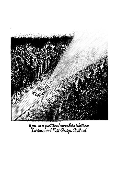
Why did I decide to split the first panel?
Picture this: I had meticulously laid out the panels in what I thought was a perfect sequence from the start. But as I delved deeper into the book design, a thought crossed my mind. What if I spilt the first panel away from the other panels? It was like adding a dash of spice to an already delicious dish.
By splitting the first panel, it became a scene-setting masterpiece. It created a sense of anticipation and intrigue, like the opening scene of a blockbuster movie. Who knew that a simple rearrangement could have such a profound impact?
Expanding the typeface identity
As I continued my design escapades, I realized that the book needed a bit more personality. So, I decided to experiment with the typeface identity. I introduced Narrative text and 'bubble' text, each using two different complementary typefaces.
The Narrative text added depth and richness to the storytelling, while the 'bubble' text brought a playful and whimsical touch. It was like having a serious conversation with a friend who constantly cracks jokes. The combination of the two typefaces created a harmonious symphony of words and visuals.
Size matters: The book aspect and trim size
Now, let's talk about size. No, not that kind of size. I'm referring to the book aspect and trim size. After much contemplation, I settled on a trim size of 244 mm x 170 mm. It was the Goldilocks of book sizes—not too big, not too small, but just right.
With this size, the book felt comfortable in the reader's hands. It was like finding the perfect pair of shoes that fit like a dream. And to add a touch of elegance, I decided to go with a hard case. Because let's face it, a book this fabulous deserves a little extra protection.
So there you have it, my fellow design enthusiasts. A tale of layouts, typeface adventures, and the quest for the perfect book design. Remember, don't be afraid to break the rules, rearrange the panels, and let your creativity soar. After all, the best designs are born from a little bit of chaos and a whole lot of imagination.