

Colour is probably one of the most difficult areas to get a grip on for anyone interested in manipulating colour. Whether you’re painting, illustrating, designing or just interested in colour as a subject. It is a complex and multi-faceted thing. The reason for this relates back to our understanding of colour and probably how we have encountered the subject of colour over our development.
I’m still learning about colour and its use but then I think I’ll still be learning about it in the next 10 to 20 years of my life. Here’s what I’ve learnt about the subject so far.
- We are immersed in a world of colour from day 1 of our lives. So by the time, we reach a certain age we are ‘colour blind’. Meaning we take a colour for granted. Through our education, we learn to see colour symbolically. So a sky is blue, a night sky black and so on. One of my most memorable moments in life touched on this. My daughter was 3 or so and she was super-talkative and present. One evening I took her with me to the supermarket across from our apartment building. We were living in Taichung, Taiwan at the time. So flat block is probably more the British English way to say it. Anyway, we were talking about the things around us and I looked up at the night sky, it was an interesting colour. I was curious about how she would see the night sky, wondering if she would automatically say black. She surprised me by saying purple, which was in fact the colour of the night sky at that point. It was dark purple. I was happy to see that she hadn’t been brainwashed into think in symbols and decided to try and keep it this way as long as I could. So the point here is to observe carefully and question why we think objects have a certain colour. I determined to challenge myself about how I see colour knowing that my brain will at times prefer to default to what it has been taught to expect. Doing this consciously changes how we see things - it’s quite amazing.
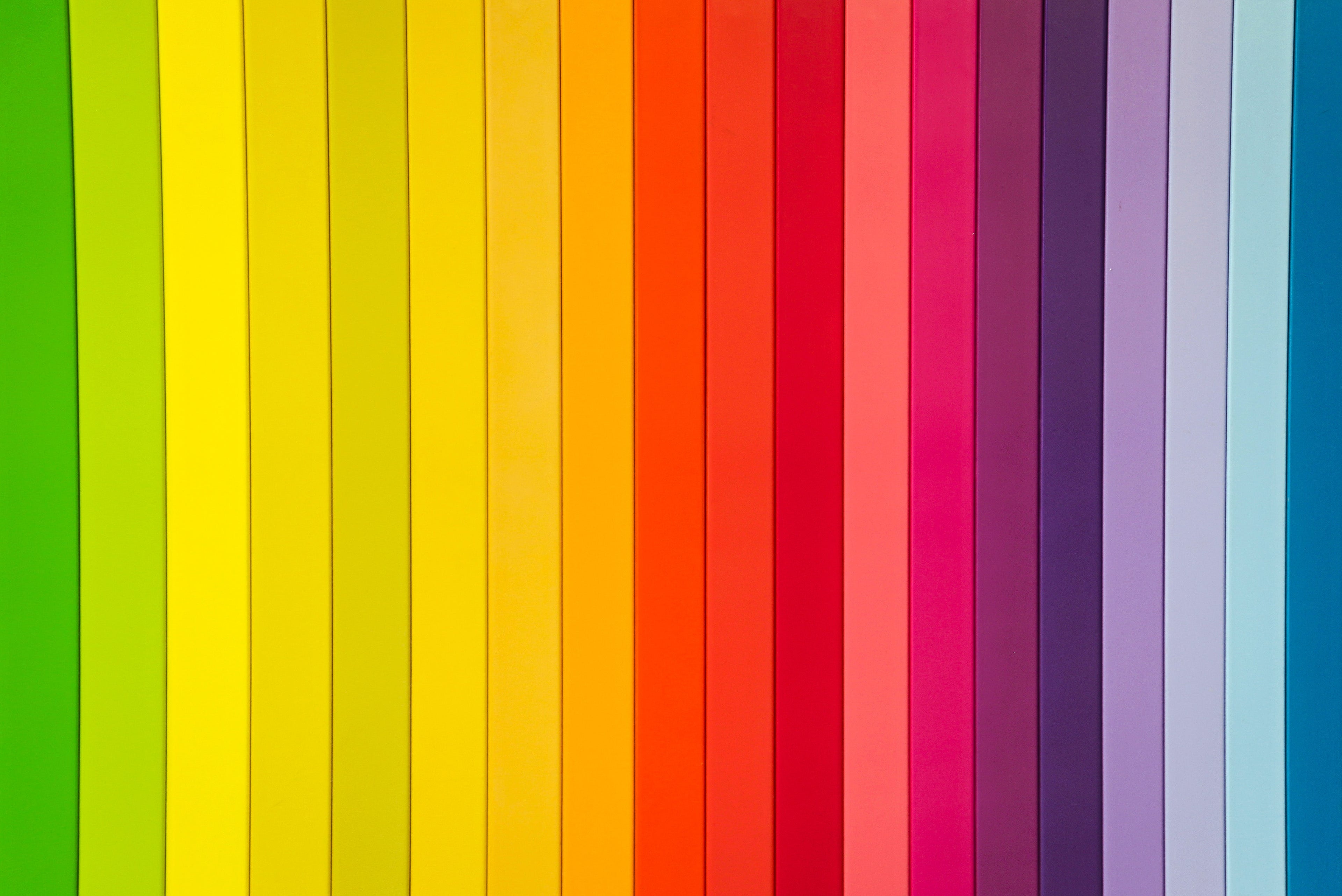
- Colour isn’t as straightforward a thing as it seems. When you begin working with a colour you think that it is just an arbitrary choice but then you begin applying your choices and it quickly becomes apparent that things are not what they seem. Colour it turns out is more of a matrix than a flat choice. We learn the colour wheel as a start to our educational journey into colour and this is a great start but it is nowhere close to describing what is happening in the world of colour. I think that a 3-dimensional form like a cube might be a better model - but of course, you’re not going to use that in kindergarten to explain colour to young children. There are of course different colour wheels we can use but that’ll mention later. Let’s carry on thinking about the complex multi-dimensional aspect of colour. Colour is essentially a hue,, however, to control colour the decision isn’t just what hue am I wanting to use like the colours on a colour wheel, but we use intensity, saturation and other properties of hue to control colour. Hopefully, my choice of thinking of colour as a matrix makes sense now. Because of this, I personally don’t think we should call every variation of colour a new colour or hue value.
- So that’s the theory of colour in a nutshell but how do we work with colour? This is something I’ve observed for a while in everyday and professional life because people don’t understand colour and here I also include many designers, who fail to differentiate between a hue and its tints and shades. I don’t see a tint or shade of a hue as a different colour but a tint or shade of that colour. I think I’m right in doing this but right or wrong it makes the colour more manageable. So imagine a brand guide with a certain colour value. A blue of some kind, strictly speaking, if I add white or black to that value the hue has not changed but the value of the hue has changed. Digitally we are manipulating the HSL value along the light and dark axis. So, we should be able to use these different values of that hue and still be able to see it as the same colour. Therefore brand managers should allow the use of a shade or a tint of a brand colour. We are taught that white and black are not colours in both additive and subtractive colour systems. So this makes sense right?
- There is so much more to mention when it comes to colour but here is the last point in this post. After a short time exploring colour, you quickly discover that there are two colour systems. Additive and subtractive. However colour, in reality, is light and even when using paint we need to remember that we manipulate paint to represent colour - that was what the impressionists taught us. See the light, not the colour. So whether we are using an additive or subtractive methodology our concern is light. Light is colour but understanding these two modalities of colour application will greatly add to one’s understanding of using colour.
Finally, the perception of colour is a human and individual thing. There are many more colours outside of the colours we can perceive and understand - just like a cat only sees the value the colours we see are limited to our own experience. Even among us humans, we have variations of perception. Colour and light, however, are scientific in nature and the reason why see or don’t see colour is to do with those realities. It is however useful to understand that the universe is much bigger than our own perceptions and that what we are so convinced is true is sometimes just a piece of the bigger picture. Having said this, there is so much more about colour that I haven’t touched on and that I could have mentioned: Colour psychology, warm and cool light, value studies and on and on and on. But hopefully, you can take something away from this post.

0 comments